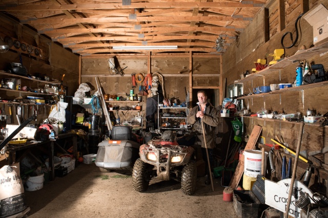
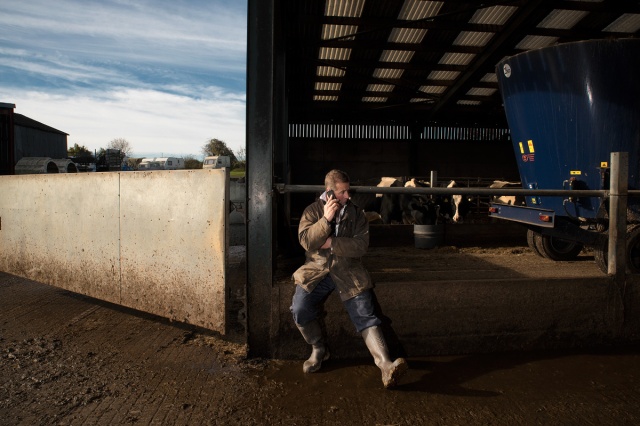
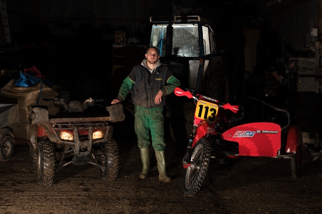
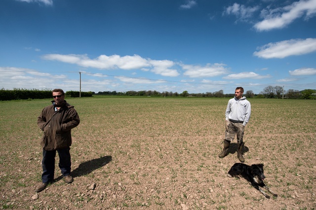
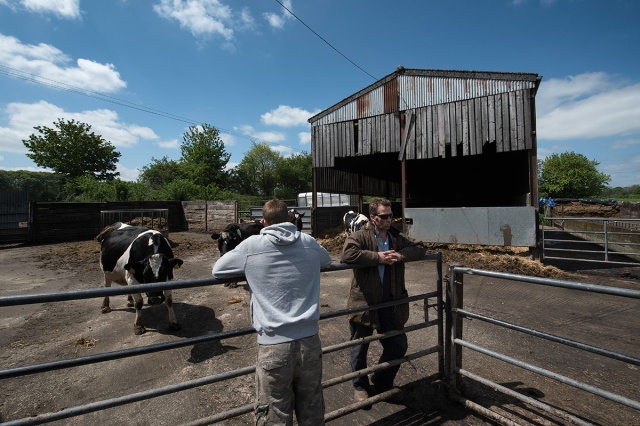
This is my current selection of photographs for assignment 5, the self-directed project at the end of Identity and Place. My intent is to explore the relationship between a farming family and their environment whilst challenging two strongly embedded ideas: the myth of the countryside idyll and the veracity of documentary style photography.
My main references were John Darwell, Scott McFarland, Colin Shaw, Gregory Crewdson, Henrik Duncker and Mark Neville.
At this stage I am posting these pictures to seek peer group critique and feedback before finalising the series.
Responses
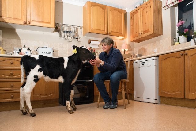
EP: Knowing that the calf in the kitchen is posed makes me wonder how much information you’re planning on giving the viewer? The challenge to the rural idyll is a very clear message, but despite the staging (particularly the indoor/outdoor shots with their clever lighting or montaging) my initial instinct was that the series is broadly “true”. Perhaps that’s your intention, but then how does the viewer know you’re actually challenging that assumption?
EP: Incidentally I can really see the crewdson influence, well done for working with what is a technically challenging style!
CB: Looks a very cohesive set and I can see how the compositional elements have been very carefully considered. I can see the challenge to the countryside idyll but not sure about the documentary reality aspect. Is that to do with the fact that some images are posed? I hope it isn’t the calf because I would love to think they actually fed it in the kitchen to keep it warm (me being romantic).
Re Scott McFarland – your view was so good that I bought the book! Maybe you should add book reviewer to your list of skills.
CW: I think the research aspects of the modules can encourage students to attempt to be too didactic in their image making. ‘Space’ needs to be left for the viewer to make up their own readings rather than have the photographer making an argument; better to make a suggestion. The images are convincing within a certain genre. They certainly wouldn’t look out of place both technically and stylistically in a Sunday colour supplement and I would mark them highly on that basis rather than them being some comment on the veracity of documentary photography; we know photography is partial anyway just by the pointing of the camera.
CW: Well I have sympathy with the basic premise, having come from a village in northwest Oxfordshire where my family have lived for generations. I’ve made two pieces of work about, motivated by the middle class flight to the country which began in the 70s, ultimately pricing the locals out of the village. One piece was as a photography student preserving locations in the village which had personal meaning for me and then again for my MA 25 years later when I went back and photographed the same locations again from the same spots as near as I could. Simply making a book pairing up the images created the narrative, i.e. the story of the fictionalisation of the village.
Professionally I’ve also colluded in that, needs must. 😀
I did the photography for a brochure for a multinational petrochemical company about delivering diesel to farms. My preferred solution would have been to have spent a few days travelling around in a tanker photographing what happened but it doesn’t work like that most of the time. The art director had designed a layout doing a thumbnail purely from his imaginings for each image required in order for it to be approved by the client. Then we went to fruit farm in Kent and recreated the thumbnails; son of the farmer offering the driver an apple and getting a pat on the head etc. The petrol company supplied their newest tanker and I remember the client insisting that the mud of the farm track be washed off the tyres. So I’ve seen it from both sides and what you have there is a sort of hybrid in that you’ve manipulated the situation in the service of a wider truth.
What impresses me most is how you’ve risen to the challenge of ‘making something happen’. Students rarely appreciate the pressure this creates. You turn up expensively to a location maybe with an entourage of five or six and they’re all looking to you for direction as to how to make something brilliant that’s going to justify your fee. I can’t fault you on that, you’ve made things happen and with an awkward technical solution too. It’s some of the most professionally polished work I’ve seen in my time at the OCA. There are also ways of suggesting that there’s more going on than there really is, often through uncomfortable and counter intuitive positioning of figures and there’s some of that going on too, perhaps unconsciously absorbed from your researches.
Finally a word about narrative, you can be mapping out an area rather than a line, which I believe you’re doing, in which case it may not matter what order the images are in as you’re not telling a chronological story you’re wanting to leave the audience with an overall feeling about what they’ve witnessed.
WR: 1-5 and 11 and 12 are my favourites. I have never critiqued and as I am only just starting out on this course I can give no compelling educated arguments, these are just my instinctive thoughts. Figure 6 is the one I am not sure on but I think with the others I am drawn into to picture but with this one I get stuck on the farmer and the way his looks like he is doing a Russian dance. I can’t undo that now I’ve seen it but my eyes don’t venture any further. I love the images where the person is inside the barns and I have to look in, I am forced to notice things such as the Halloween costume and I really like the farmer in the turquoise apron he almost looks like a mermaid which amuses me and intrigues me at the same time. I hope this helps
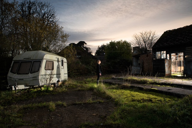
A O’N: 1 is great and original. 2, 11, 12 really strong as well especially 12 – can see the Crewdson influence – great control of light and composition. 3, 4, 5 really good as well 5 better than 4 or is it? 6-10 all decent but do 8,9,10 start to take the series in two directions? 10 for instance is a very straight forward image whereas 12 is full of mystery and surrealism. My advice would be – really be specific about the idea and concept of the series then be firm with yourself about what fits and what doesn’t.
I think I’d be basing the whole thing around 12 – It’s a brilliant brilliant image. Be bold. You could go 1,2,3 then either 4 or 5. 6,7 fine – is there enough light in 7 I’m sure there is, you’ll know better. You could drop 8,9,10, keeping 11, 12. Which ever way you go in the end you’ve got a great long-list well done!
How did you get that light onto the caravan? Is there additional lighting in the barn? Hope this is useful.
AO’N: Excellent Steve, this is a really great piece of work! Regards, Allan
MG: 2,4,11,12 are fantastic because of the mood and lighting of dusk and they all have variable gaze. Not keen on 8,9, 10 as they break the mood of the series and look more staged. The posed in the milking shed is excellent. 11 and 12 which are the best shots as they are Edward Hopper like in style and enigmatic. If this series is about the autumn of our farming industry and the farmer and his wife then let them be dark and moody.
AF: 3,5,6,7 I enjoy as a series; the proximity to the subjects and the darkness that surrounds them. The posed shots in an unlikely setting gives them a eye-catching surreality. Reminds me of the atmosphere in some of the Martin Parr, Rhubarb Triangle work …
LK: I like 1 (sets the stage), 2, 3, 5, 11 and 12. I really love 10, but it doesn’t have the same feel and mood as the others. I’d stick with the Crewdson effect you’ve got going here. Really good series as always Steve.
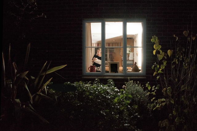
KA: Running out of day here, but great shots. My choices would be the ones that show both inside and outside spaces in the same shot, I love the contrast between the electric light and the outdoor light and the indoor/outdoor textures. Really like how you’ve done these, great modern take on farming.
PH: I like the first one very much because of the play with dimension and perspective, and the others are great as well, but a slightly different style. Only in 1 or 2 cases I think a little bit cropping would draw me more in. but of course it is about “place” as well, I think.
HW: Great set, Steve. I’d stick with the Crewdson vibe too. It works really well.
PH: Your image number one still resonates with me, it´s probably an image you could put on an exhibition or sell to a Texas millionaire… – I did wonder, because I follow your photography already since some time, when you pst it here, whether you also could experiment with a frame outside the image, in case of image 1 that would probably also look fantastic.
NF: They are great shots i love the saturation and how you have divided some frames in two and others from the window if I can only say I feel the 8th image is the weakest aesthetically but I like how one many is looking at the other as if he is waiting on a reply to something. all the rest made me smile and want to know more about the people in it . I had a sense of the identity of the people in it.
AB: Sorry I’m too late for my comment to be of any help Steve. I love the whole set, particularly the posed shots. There is a strong narrative going on in all of them though, good luck with this assignment.
EF: As others have said, it is an interesting set. Purely on sequencing, I am not sure that no.1 works well as an opening image or a good link to 2. I don’t think you need both 4 and 5. I like 4 because it echoes a number of the other images where we are looking into lit spaces and also conscious of the unlit outside. It gives a sense of humans in a relatively isolated and at times lonely and vulnerable environment.
AO’N: Agree, a good set. I like the composition and lighting. I might add an action shot or two of the people working. I think the stand out shot of non-action is the one with the green machinery in the background, so it might be worthwhile replacing some of the other standing shots with action shots. Well done overall!
BC: To me 2, 3, 4 and 5 all have a very similar rhetorical meaning, they all seem to be talking about or referring to farming as an isolated and hard working occupation and I wonder should you include them all? 2 gives a good sense of the hard work and isolation involved in farming and I agree with Eileen on no 1, I’m not sure its a good opener but it is a strong image and might make a good counterfoil to No 10. Im not sure what no 11 is trying to say? I find no. 12 an very interesting image, theres an interesting narrative going on here and its interesting that this is a woman gazing into the shed while, for example 2,4 & 5 feature a man gazing out.
HW: Great set, Steve. I’d stick with the Crewdson vibe too. It works really well.

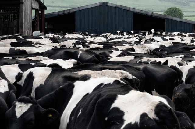
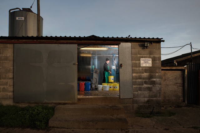
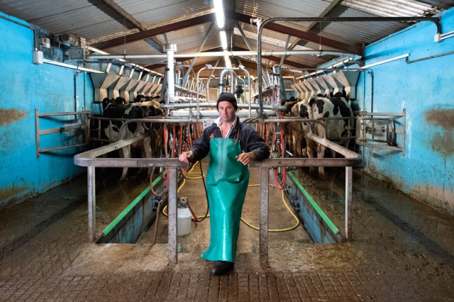
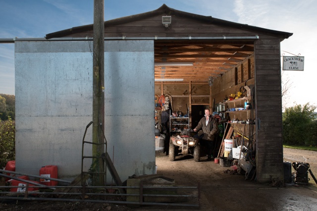
At a scan on my phone looking good for the intention. Good job. 😀
Looks a very cohesive set and I can see how the compositional elements have been very carefully considered. I can see the challenge to the countryside idyll but not sure about the documentary reality aspect. Is that to do with the fact that some images are posed? I hope it isn’t the calf because I would love to think they actually fed it in the kitchen to keep it warm (me being romantic).
Re Scott McFarland – your view was so good that I bought the book! Maybe you should add book reviewer to your list of skills.
Thank you. The challenge to documentary lies partly in the staging of some of the shots, the very false introduced lighting in others and the fact that three are combination “prints” of multiple originals. I’m sorry the calf was specifically carried into the kitchen, its not a very romantic place.
Knowing that the calf in the kitchen is posed makes me wonder how much information you’re planning on giving the viewer? The challenge to the rural idyll is a very clear message, but despite the staging (particularly the indoor/outdoor shots with their clever lighting or montaging) my initial instinct was that the series is broadly “true”. Perhaps that’s your intention, but then how does the viewer know you’re actually challenging that assumption?
Thank you Emma. Whilst recognising that in the context of the course it is necessary to explain ourselves in the accompanying essay but I actually prefer offering the viewer that absolute minimum of information. This project has been interesting as I have had two bites at it (assignment 2 and this one) and the real difference is in my relationship with the subjects so that back at the beginning of the year it was fly-on-the wall documentary whereas ten months later we know each other well and they understand what I am trying to achieve so nearly every shot is posed to some degree and about half of them are pre-planned – I’m not even sure where the dividing line is between posing and staging. I think your instinct is right, the series is “broadly true”, it is not a set, they aren’t actors so the staged pictures are some sort of imagined reality.
Incidentally I can really see the crewdson influence, well done for working with what is a technically challenging style!
I think the research aspects of the modules can encourage students to attempt to be too didactic in their image making. ‘Space’ needs to be left for the viewer to make up their own readings rather than have the photographer making an argument; better to make a suggestion. The images are convincing within a certain genre. They certainly wouldn’t look out of place both technically and stylistically in a Sunday colour supplement and I would mark them highly on that basis rather than them being some comment on the veracity of documentary photography; we know photography is partial anyway just by the pointing of the camera.
Thank you Clive. I take your point and agree that we spend so much time investigating the intent of other practitioners that it encourages us to rather over-egg the intent in our own work. Throughout the project I was holding the idea of disrupting the rural idyll in mind but as the project progressed I became very interested in Scott McFarland’s work which appears documentary in nature but is often staged and highly manipulated; this idea appeals to me as it covertly increases the ambiguity of the photograph creating a tension between fact and fiction. Perhaps I’m over thinking it.
Well I have sympathy with the basic premise, having come from a village in northwest Oxfordshire where my family have lived for generations. I’ve made two pieces of work about, motivated by the middle class flight to the country which began in the 70s, ultimately pricing the locals out of the village. One piece was as a photography student preserving locations in the village which had personal meaning for me and then again for my MA 25 years later when I went back and photographed the same locations again from the same spots as near as I could. Simply making a book pairing up the images created the narrative, i.e. the story of the fictionalisation of the village.
Professionally I’ve also colluded in that, needs must. 😀
I did the photography for a brochure for a multinational petrochemical company about delivering diesel to farms. My preferred solution would have been to have spent a few days travelling around in a tanker photographing what happened but it doesn’t work like that most of the time. The art director had designed a layout doing a thumbnail purely from his imaginings for each image required in order for it to be approved by the client. Then we went to fruit farm in Kent and recreated the thumbnails; son of the farmer offering the driver an apple and getting a pat on the head etc. The petrol company supplied their newest tanker and I remember the client insisting that the mud of the farm track be washed off the tyres. So I’ve seen it from both sides and what you have there is a sort of hybrid in that you’ve manipulated the situation in the service of a wider truth.
What impresses me most is how you’ve risen to the challenge of ‘making something happen’. Students rarely appreciate the pressure this creates. You turn up expensively to a location maybe with an entourage of five or six and they’re all looking to you for direction as to how to make something brilliant that’s going to justify your fee. I can’t fault you on that, you’ve made things happen and with an awkward technical solution too. It’s some of the most professionally polished work I’ve seen in my time at the OCA. There are also ways of suggesting that there’s more going on than there really is, often through uncomfortable and counter intuitive positioning of figures and there’s some of that going on too, perhaps unconsciously absorbed from your researches.
Finally a word about narrative, you can be mapping out an area rather than a line, which I believe you’re doing, in which case it may not matter what order the images are in as you’re not telling a chronological story you’re wanting to leave the audience with an overall feeling about what they’ve witnessed.
Thank you Clive – Even as an amateur I am beginning to understand the pressure you refer to. The family I was working with are the kindest and most cooperative people you could ever hope to meet but this meant that, once they understood what I was trying to achieve, instead of just getting on with their lives on the days I visited them there was an expectation that I would tell them what I wanted. I learnt very quickly that I needed to have clear plans in my head, to do otherwise was in effect disrespectful, I was disrupting their business and their lives and that should not be taken lightly. After the first couple of getting to know each other visits they had an expectation that I would make something happen. Of course, because they are helpful people, they also had their own ideas of what a photographer would want and I have plenty of “nice” photos of the best views on the farm, favourite cows and most productive bulls which didn’t fit into my project but give me plenty of material to create a thank you book and, anyway, I secretly like a bit of rural idyll.
Your point on narrative is well made and thank you for putting that into perspective.
The insights into your professional world are interesting; I have watched professional food photographers at work under the direction of food stylists and clients and it intrigues me how quickly the trained professional who probably also has an art degree behind them quickly becomes positioned as a technician in such circumstances. As you say needs must.
Thank you for spending the time to write two such helpful pieces of feedback.
Well I’m not sure what sort of food shoot you were at but I’ve shot food for cook chill packing for all the major supermarkets and I would choose the home economist and the stylist, based on taste and ability. The stylist would bring a range of props and myself and the designer would together decide what props to use and how to compose them, so there was creative input from me at every stage and indeed I would be hired on the basis of ‘the look’ and provenance of my previous work; it’s a well known Catch 22 of high end professional work, if it’s not already in your ‘book’ you can’t get the work. Once one has manoeuvred around that you need to have an edge, something that makes you distinctive, a reason to be chosen.
Since the spread of the web there’s been an explosion in aspiring photographers’ websites touting for work as a second string, nearly all of them indistinguishable; apart from local convenience why would anyone want to hire them over anyone else.
A degree in photography isn’t a training in commercial photography but it gives the opportunity to develop ones creative thinking and practice, which can be a great aid in producing distinctive creative solutions to client visual communication problems.
Not sure if this posted at first attempt, apologies if it’s a repost…
Well I’m not sure what sort of food shoot you were at but I’ve shot food for cook chill packing for all the major supermarkets and I would choose the home economist and the stylist, based on taste and ability. The stylist would bring a range of props and myself and the designer would together decide what props to use and how to compose them, so there was creative input from me at every stage and indeed I would be hired on the basis of ‘the look’ and provenance of my previous work; it’s a well known Catch 22 of high end professional work, if it’s not already in your ‘book’ you can’t get the work. Once one has manoeuvred around that you need to have an edge, something that makes you distinctive, a reason to be chosen.
Since the spread of the web there’s been an explosion in aspiring photographers’ websites touting for work as a second string, nearly all of them indistinguishable; apart from local convenience why would anyone want to hire them over anyone else.
A degree in photography isn’t a training in commercial photography but it gives the opportunity to develop ones creative thinking and practice, which can be a great aid in producing distinctive creative solutions to client visual communication problems.